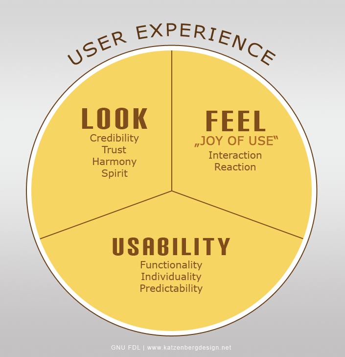
UX, or User Experience Design, is a strategy of designing websites with the goal of user satisfaction. The focus is on improving the usability and accessibility of the website and making sure that the website visitor enjoys the website, rather than just using it as a means to an end. While UX is officially a different method than visual design, the two methods are best used together, to create a website that internet users enjoy.
Visual design is a very important aspect of UX. Through visual design, a website relies on images, color choices, shapes, typography, and form to improve the overall user experience with the website. Since users decide whether to trust a website based on their visual perceptions of the website, rather than content, design is incredibly important. Visual design uses elements like colors, images, and symbols to convey a message to website visitors and create a positive first impression.

Elements of Visual Design
Visual design consists of several elements, which work together to create a website that is pleasing to the eye. Lines are the most basic element, and they are used to connect two distinct points, define shapes, create divisions, and create texture. Shapes are created from lines and are self-contained areas with defined boundaries.
The color palette chosen for the website is very important. There’s a psychological impact on website visitors from color choices, and those colors create positive or negative reactions. Colors can be used to differentiate items from each other, organize information on the web page, and add depth and emphasis to your website.
Texture, since a website is not three-dimensional, is all about perception. Texture is used to create a perception of how a surface should feel, and by repeating certain elements, texture is created and patterns are formed in a person’s perception. Texture can be used to either deter attention from or attract attention to a particular section of a website.
Typography refers to the usage of fonts to create particular perceptions. Fonts can be perceived differently, depending on their size, the alignment used, the color of the fonts, and spacing with words and lines.
The last major element of visual design is form, which refers to the perception of 3-dimensional objects. These objects need to give a feeling of size, including volume and mass, and this is done by combining shapes and using carefully planned colors, tones, and textures.

Considerations of Creating the Visual Design
There are a number of aspects that must come together to create a good website that people enjoy. Gestalt is a rather vague term that refers to helping people perceive the website as an overall design, rather than its individual parts, and one of the important parts of Gestalt is unity. Unity means that the elements of the web page seem to belong together, either visually or conceptually. Similarity is also used to give the feeling of unity, by creating a sense of continuity throughout the design, which also helps the users learn quickly how to navigate the website.
Space is another important part of visual design. Space is really only defined when something is placed within it, so white space only becomes effective when used with other parts of the design. This white space, as it’s known, can be used to improve the readability of your website, along with reducing clutter.
The hierarchy of a page is another important aspect to consider. Hierarchy shows the difference in significance between particular items on the page. Items at the top of the page are perceived as most important, and you can use placement and different fonts and colors to create that perception of difference.
Balance and contrast are two items which often use each other to create a particular perception. Balance creates the impression that there is equal distribution throughout the page, although this does not necessarily mean symmetry. Contrast is used to make certain items stand out by emphasizing differences in size, color, or direction.
Scale and dominance are other ways to create contrasts between items on the page. Scale refers to the size of items, and uses the differences in size to demonstrate how items relate to each other. Scaling can also be used to establish dominance, which means that one element is established as a focal point, with the others being subordinate to it.

Incorporating Visual Design into UX
There are many ways to incorporate visual design into the User Experience Design and to incorporate visual design elements into the website. Use a grid system and take advantage of design patterns to give a feeling of balance in the website layout. Rather than concentrating on placing all the important information above the fold, learn to use the fold as part of your website, to encourage people to continue on below it.
Using subtle lines to connect components of the website will create the important perception of unity throughout the pages. Animation may be incorporated into the website, if it’s appropriate, but should be used sparingly. The goal with your website should be a clean, simple design, and one of the ways to continue with that idea is to rely on flatness through your website, rather than glossiness. Glossy finishes create too much distraction and noise for visitors. Too much clutter on your website can overwhelm visitors and cause them to leave the site.
Most importantly, be consistent throughout your website design. Visual design focuses on continuity throughout a website, which creates a sense that everything belongs. You can use all the elements of visual design to give your website visitors pages that they can intuitively navigate and feel welcomed.
Final Words
Visual design focuses on the aesthetics portion of UX (User Experience Design). Visual design ensures that the website looks good and communicates the right message to viewers. Really, visual design and UX should be intertwined to create the best possible website for users to enjoy. It’s nearly impossible to separate the importance of both. The two kinds of designs may be done by separate designers, but it’s important for both designers to work in collaboration with each other to create a great design.
1 Comment
You have discussed an interesting topic that every designer to know. Very well explained with examples.